ReferencePaginateDropdown
Reference
- The
ReferenceAttributePaginateDropDowncomponent is a reusable dropdown component that supports asynchronous data loading and pagination. - It is designed to fetch and display a list of options dynamically based on user input or predefined filters
- Use this component when you need a dropdown that dynamically fetches data from the backend.
- Ideal for scenarios where the list of options is too large to load all at once.
- Supports advanced filtering and relationship-based queries.
Props and Their Usage
Required Props
-
instanceId(optional):- The ID of the current instance.
- Used to fetch connectable instances related to the current instance.
-
relatedTypeName:- The type of instances to fetch.
- Determines the type of data to be displayed in the dropdown.
-
config:- Configuration object for filters and query parameters.
- Includes:
stateFilter: Filters based on the state of instances.attributeFilter: Filters based on specific attributes.relationTypeNameandrelationDirection: Used to fetch instances based on relationships.
-
selectedReferences:- Pre-selected values for the dropdown.
- Used to display the initial selection.
-
onEdit:- Callback function triggered when the user selects or changes a value.
- Receives the selected value(s) as an argument.
Optional Props
-
onFocusOut(optional):- Callback function triggered when the dropdown loses focus.
-
placeholder(optional):- Custom placeholder text for the dropdown.
- Defaults to "Select an option" (single-select) or "Select some options" (multi-select).
-
customStyle(optional):- Custom styles for the dropdown.
- Merged with the default styles defined in
PicklistRenderStyling.
-
isDisabled(default:false):- Disables the dropdown if set to
true.
- Disables the dropdown if set to
-
isMultiselect(default:false):- Enables multi-select mode if set to
true.
- Enables multi-select mode if set to
-
menuPlacement(default:'auto'):- Determines the placement of the dropdown menu (e.g.,
'top','bottom','auto').
- Determines the placement of the dropdown menu (e.g.,
Key Features
- Asynchronous Data Loading: Fetches data from an API endpoint as the user types or scrolls.
- Pagination Support: Loads additional options when the user scrolls to the bottom of the dropdown.
- Single or Multi-Select: Supports both single and multi-select modes.
- Customizable: Allows customization of styles, placeholder text, and other behaviors.
- Integration with Backend: Fetches data using the
protrakApiClientand applies filters like state filters, attribute filters, and relation filters.
Example Usage
    <ReferenceAttributePaginateDropDown
      instanceId="12345"
      relatedTypeName="Task"
      config={{
        stateFilter: { states: ['Active', 'Completed'] },
        attributeFilter: {
          attributeGroups: [
            {
              AttributeFilterConditions: [
                {
                  AttributeName: 'Name',
                  Condition: 'Contains',
                  FirstValue: 'Test',
                  Operator: 'None',
                },
              ],
              Operator: 'And',
            },
          ],
        },
        relationTypeName: 'ParentChild',
        relationDirection: 'Outgoing',
      }}
      selectedReferences={[{ name: 'Task 1', id: '1' }]}
      onEdit={handleEdit}
      placeholder="Select a task"
      isMultiselect={true}
    />
Usage
const { protrakComponents } = React.useContext(customWidgetContext);
const { ReferenceAttributePaginateDropDown } = protrakComponents;
Example of config property:
{
"fieldType": "Attribute",
"attributeType": "Reference",
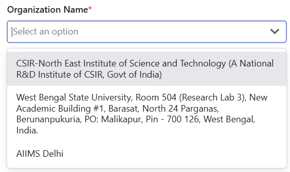
"label": "Organization Name",
"isVisible": false,
"isEditable": false,
"isRelatedTypeGeolocationAttribute": false,
"attributeName": "TTInstitute",
"relationTypeName": "InstituteToTechnologyTransfer",
"relatedTypeName": "Department",
"canCreateRelatedType": false,
"relatedTypeTrackingRequired": false,
"relationDirection": "From",
"isRequired": true,
"regExErrorMessage": "",
"isMultiselect": false,
"stateFilter": {
"lifecycleName": "Department",
"enforced": true,
"states": []
},
"attributeFilter": {
"attributeGroups": [
{
"operator": "None",
"attributeFilterConditions": [
{
"attributeName": "InstituteShortCode",
"condition": "Contains",
"firstValue": "@User.STANDARDDivisionShortCodes",
"operator": "None"
}
]
}
]
},
"allowValueCaptureFromScan": false,
"linkOption": "SearchOnly",
"actionSettingsShowAs": "Default",
"editor": "Dropdown",
"renderer": "Default"
}
<ReferenceAttributePaginateDropDown
selectedReferences={selectedOption}
relatedTypeName={"Department"}
isMultiselect={false}
onEdit={(event) => onReferenceDropdownValueChange(event)}
config={
fields.filter((field) => field.attributeName === "DeptTOInv")[0]
}
placeholder={
fields.filter((field) => field.attributeName === "DeptTOInv")[0]
?.placeholder
}
/>
UI