ProtrakDateTime
Reference
- The
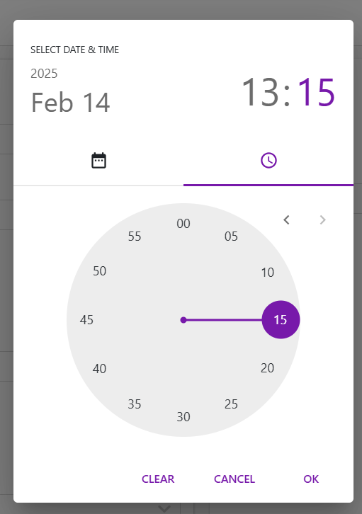
ProtrakDateTimecomponent is display custom date-time picker. - It supports tenant-specific time zones, custom layouts, and flexible date-time formats.
Props
-
value- Type:
string - Description: The selected date-time in UTC format.
- Type:
-
onEdit- Type:
function - Description: Callback triggered when the date-time value changes.
- Type:
-
onFocusOut- Type:
function - Description: Callback triggered when the picker loses focus.
- Type:
-
placeholder- Type:
string - Description: Placeholder text for the input field.
- Type:
-
minDate/maxDate- Type:
string - Description: Sets the minimum and maximum selectable dates.
- Type:
-
disabled- Type:
boolean - Default:
false - Description: Disables the picker if
true.
- Type:
-
isOnlyTime- Type:
boolean - Default:
false - Description: If
true, only the time picker is displayed.
- Type:
-
isUtcTimeZone- Type:
boolean - Default:
false - Description: If
true, uses UTC time zone instead of the tenant's time zone.
- Type:
-
style- Type:
object - Description: Custom styles for the picker.
- Type:
Usage Example
function Example(pageContext) {
    const { protrakComponents } = React.useContext(customWidgetContext);
    const { ProtrakDateTime } = protrakComponents;
    return(
        <ProtrakDateTime
            value="2025-04-08 14:30:00"
            onEdit={(newValue) => console.log('Selected DateTime:', newValue)}
            placeholder="Select date and time"
            isOnlyTime={false}
            minDate="2025-01-01"
            maxDate="2025-12-31"
            style={{ width: '300px' }}
        />
    );
}
- This renders a date-time picker with a placeholder, restricted date range, and logs the selected value on change.
UI