Target type CreateLayout
The custom widget can be rendered in Create layout as a section.
Coding guidelines
pageContextThe page context provided has following content
{
  attributeValues: object of attributes configured in a create layout of instance type
  editedValues: object of edited attribute values in custom widget as well as attributes in Section/Groups,
  getAttributeWorkingValue: get attributes' values
  instanceType: string value,
  isPromoteInProgress: function called when promote is in progress
  onAttributeEdit: function called on editing attributes in custom widget to update editedValues object & corresponding attribute values in the standard widgets of the same layout.
  reloadInstanceDetails: function to reload an instance through custom widget
  createInstance: function to create an instance through custom widget,
  saveOperationState: saveOperationState : {data, isLoading, isError},
  userData: Object of logged in user details
}
- For more details on
userDatacheck pageContext.userData
Typical use cases
- Used in displaying custom widgets for the Create layout in section.
- Create Layout type custom widget when configured as a section allows user to create UI & functionality from scratch giving a blank canvas.
- Role and Rule(display conditions) based visibility can be controlled by Create layout configurations.
- Typically used to show non-standard data visualization or user interactions that require data fetching or update requirements with additional business logic or validations
Sample Code
-onAttributeEdit : function from pageContext, with parameters (attributeName, value, errorMessage), used to update the value of the attributes configured in the standard groups of the same layout from the custom widget configured as a section in the same layout.
function CommunityQuickPollOptions(pageContext) {
  const {
    instanceId,
    attributeValues,
    onAttributeEdit,
    editedValues,
    saveInstance,
  } = pageContext;
  const { protrakUtils, protrakComponents } =
    React.useContext(customWidgetContext);
  const { Box, Button, ButtonEnums, Label, TextBox } = protrakComponents;
  const [addOption, setOptions] = React.useState([]);

  const handleAddOption = () => {
    const newOption = { value: '', text: '' };
    const test = [...addOption, newOption];
    setOptions([...addOption, newOption]);
    const attr = {
      name: 'QuickPollOptions',
      type: 'Text',
      canUpdate: true,
      textValue: JSON.stringify(test),
    };
    onAttributeEdit('QuickPollOptions', attr, '');
  };

  const handleCancelOption = (index) => {
    const newOptions = [...addOption];
    newOptions.splice(index, 1);
    setOptions(newOptions);
  };

  const handleOptionLabelChange = (index, value) => {
    const newOptions = [...addOption];
    newOptions[index].value = value;
    setOptions(newOptions);
  };

  const handleOptionValueChange = (index, value) => {
    const newOptions = [...addOption];
    newOptions[index].text = value;
    setOptions(newOptions);
  };

  return (
    <Box style={{ display: 'block', padding: '1rem' }}>
      <Button
        onClick={handleAddOption}
        title="Add Options"
        text={'Add Options'}
        appearance={ButtonEnums.Appearance.Primary}
        style={{ width: 'fit-content', padding: '0.5rem' }}
      />
      <table>
        <tbody>
          {addOption.map((option, index) => (
            <tr key={index}>
              <td>
                <Label
                  style={{
                    fontWeight: '600',
                    display: 'inline-flex',
                    alignItems: 'center',
                    paddingBottom: '7px',
                    fontSize: 12,
                  }}
                >
                  {'Label'}
                </Label>
                <TextBox
                  value={option.value}
                  onEdit={(e) => handleOptionLabelChange(index, e)}
                />
              </td>
              <td style={{ paddingLeft: '1rem' }}>
                <Label
                  style={{
                    fontWeight: '600',
                    display: 'inline-flex',
                    alignItems: 'center',
                    paddingBottom: '7px',
                    fontSize: 12,
                  }}
                >
                  {'Value'}
                </Label>

                <TextBox
                  value={option.text}
                  onEdit={(e) => handleOptionValueChange(index, e)}
                />
              </td>

              <td>
                <div
                  onClick={() => handleCancelOption(index)}
                  style={{
                    marginLeft: '0.8rem',
                    justifySelf: 'center',
                    padding: '0 0 0 2px',
                    marginLeft: '1rem',
                    marginTop: '1.5rem',
                    color: 'var(--error)',
                    fontSize: '1.2rem',
                  }}
                >
                  <i className="fa fa-times" aria-hidden="true" />
                </div>
              </td>
            </tr>
          ))}
        </tbody>
      </table>
    </Box>
  );
}
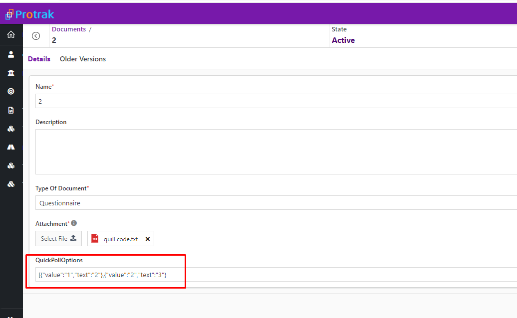
Here's a preview of how this custom widget looks like.
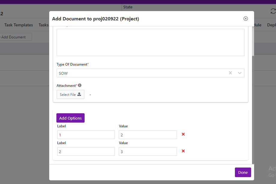 On 'Add Options' button click, 'QuickPollOptions' attribute value is updated