Target type ViewLayoutWidget
The custom widget can be rendered as a relation widget in View Layout with default functionalities of Export, Filters, Add & Link Instances according to user's permissions configured.
Coding guidelines
pageContextThe page context provided has following content
{
    userData: Object of logged in user details
    settings: {
       instanceInfo: {
          instanceId,
          instanceType: instanceTypeName,
          instanceName,
          typePluralName: viewConfiguration.typePluralName,
          typeSingularName: viewConfiguration.typeSingularName,
          getAllowedOperations,
        }, //details of the parent instance
        relationInstanceInfo: {
           relationAttributes,
           relationTypeDetails: relationConfig,
           relationTypeCardinality,
           relationTypeName,
        }, //details of the relation type
        relatedInstanceInfo: {
          relatedInstanceDetails: instanceDetails,
          relatedTypeName: typeName,
          totalRelatedItems: items,
        }, //details of the related instance
        canConnect : boolean value to check for link permission in relation widget,
        canLinkAndCreate : boolean value to check for create & link permission in relation widget,
        reload : function to relaod relation widget,
        getNextPage,
        paginationState : {skip, take},
        runRelatedInstanceQuery : to fetch related data,
        canCreateInstance: bolean to check for create instanec permission,
        sortState : {isSortByDescending, sortBy},
        onSortApplied : function to. update sortState after changing sorting state,
        reloadInstanceDetails : function to reload an instance through custom widget,
    }
}
- Along with this,
pageContextcontains few more properties that are common to all widget types. For details check: common pageContext
Typical use cases
- Used in displaying custom widgets for the View layout as a relation widget.
- ViewLayoutWidget type custom widget provides default functionalities of Export, Filters, Add & link instances
- Parent filters, state filters & attribute filters are configurable from View layout.
- Role and Rule(display conditions) based visibility can be controlled by View layout configurations.
- Typically used to show non-standard data visualization or user interactions that require data fetching or update requirements with additional business logic or validations
Sample Code
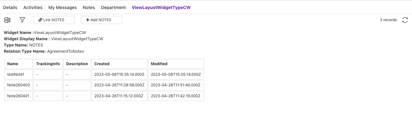
- Here's an example of a ViewLayoutWidget type custom widget that:
- uses relationInstanceInfo from pageContext to show deatils
- uses relatedInstanceInfo from pageContext to show linked instances in a table form.
- New instances can be created & linked using Add/Link functionalities of relation widget & on relaod new data will be updated in custom widget table
function ViewLayoutWidgetTypeCW(pageContext) {
  const { protrakUtils, protrakComponents } =
    React.useContext(customWidgetContext);
  const { Enums } = protrakUtils;
  const { Text, Box } = protrakComponents;

  const cellStyle = {
    border: '1px solid #dddddd',
    textAlign: 'left',
    padding: '8px',
    minWidth: '2rem',
    borderCollapse: 'collapse',
    contentEditable: 'true',
  };

  const renderInstanceDetails = (pageContextValue) => {
    const relatedInstDetails =
      pageContextValue.relatedInstanceInfo.relatedInstanceDetails;
    if (
      relatedInstDetails !== undefined &&
      relatedInstDetails.data !== undefined
    ) {
      return (
        relatedInstDetails.data.items &&
        relatedInstDetails.data.items.map(function (item) {
          return (
            <tr>
              {item.attributes.map((attr) => {
                let attrType = getAttributeType(Enums, attr.type);
                return <td style={cellStyle}>{attr[attrType] || '-'}</td>;
              })}
            </tr>
          );
        })
      );
    }
  };

  const getColumns = (relatedInstDetails) => {
    return (
      relatedInstDetails &&
      relatedInstDetails.data &&
      relatedInstDetails.data.items &&
      relatedInstDetails.data.items[0].attributes.map((attr) => {
        return <th style={cellStyle}>{attr.name}</th>;
      })
    );
  };

  return (
    <Box style={{ display: 'flex', flexDirection: 'column' }}>
      <Box style={{ display: 'flex', flexDirection: 'column' }}>
        <Text>
          <b>Widget Name :</b>
          {pageContext.relationInstanceInfo.relationTypeDetails.name}{' '}
        </Text>
        <Text>
          <b>Widget Display Name :</b>{' '}
          {pageContext.relationInstanceInfo.relationTypeDetails &&
            pageContext.relationInstanceInfo.relationTypeDetails
              .displayName}{' '}
        </Text>
        <Text>
          {' '}
          <b>Type Name:</b> {pageContext.relatedInstanceInfo.relatedTypeName}{' '}
        </Text>
        <Text>
          {' '}
          <b>Relation Type Name:</b>{' '}
          {pageContext.relationInstanceInfo.relationTypeName}{' '}
        </Text>
      </Box>
      <Box style={{ marginTop: '1rem' }}>
        <table>
          <thead>
            <tr style={{ textAlign: 'left' }}>
              {getColumns(
                pageContext.relatedInstanceInfo.relatedInstanceDetails
              )}
            </tr>
          </thead>
          <tbody>{renderInstanceDetails(pageContext)}</tbody>
        </table>
      </Box>
    </Box>
  );
}

const getAttributeType = (Enums, attrType) => {
  switch (attrType) {
    case Enums.AttributeTypes.Boolean:
      return 'booleanValue';
    case Enums.AttributeTypes.Currency:
    case Enums.AttributeTypes.Numeric:
      return 'numericValue';
    case Enums.AttributeTypes.Date:
    case Enums.AttributeTypes.DateTime:
      return 'dateValue';
    case Enums.AttributeTypes.Text:
      return 'textValue';
    case Enums.AttributeTypes.Picklist:
      return 'arrayValue';
    case Enums.AttributeTypes.User:
      return 'userValues';
    case Enums.AttributeTypes.Reference:
      return 'referenceValues';
    default:
      return null;
  }
};
Here's a preview of how this custom widget looks like.