Headings
References
- Heading components like H1, H2, H3, H4, and H5 are typically styled versions of HTML heading tags
- They are used to define the hierarchy and structure of content on a webpage.
- In styled-components, these components are customized with specific styles and props for flexibility.
- It uses props to dynamically apply styles like font-size, color, margin, and font-weight.
- It also supports hover effects.
- To know more about heading : HTML Headings
Usage Example:
const { protrakComponents } = React.useContext(customWidgetContext);
const { H1, H2, H3, H4, H5 } = protrakComponents;
return(
<H1>
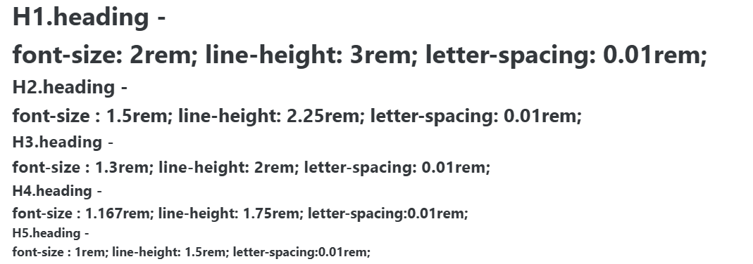
H1.heading - <br />
font-size: 2rem; line-height: 3rem; letter-spacing: 0.01rem;
</H1>
<H2>
H2.heading - <br />
font-size : 1.5rem; line-height: 2.25rem; letter-spacing: 0.01rem;
</H2>
<H3>
H3.heading - <br />
font-size : 1.3rem; line-height: 2rem; letter-spacing: 0.01rem;
</H3>
<H4>
H4.heading - <br />
font-size : 1.167rem; line-height: 1.75rem; letter-spacing:0.01rem;
</H4>
<H5>
H5.heading - <br />
font-size : 1rem; line-height: 1.5rem; letter-spacing:0.01rem;
</H5>
</>
);
UI