Example of config property:
const config = {
"fieldType": "Attribute",
"attributeType": "Picklist",
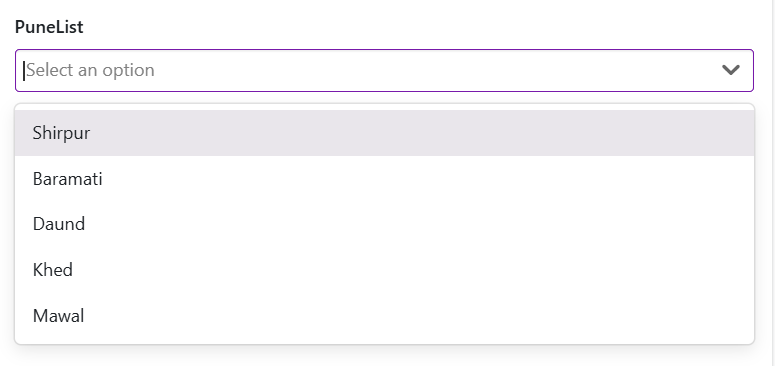
"label": "PuneList",
"isVisible": false,
"isEditable": false,
"isRelatedTypeGeolocationAttribute": false,
"attributeName": "PuneList",
"isRequired": false,
"options": [
{
"name": "Shirpur",
"displayName": "Shirpur",
"disabled": false
},
{
"name": "Baramati",
"displayName": "Baramati",
"disabled": false
},
{
"name": "Daund",
"displayName": "Daund",
"disabled": false
},
{
"name": "Khed",
"displayName": "Khed",
"disabled": false
},
{
"name": "Mawal",
"displayName": "Mawal",
"disabled": false
}
],
"regExErrorMessage": "",
"isMultiselect": false,
"allowValueCaptureFromScan": false,
"actionSettingsShowAs": "Default",
"editor": "Default",
"renderer": "Default"
}