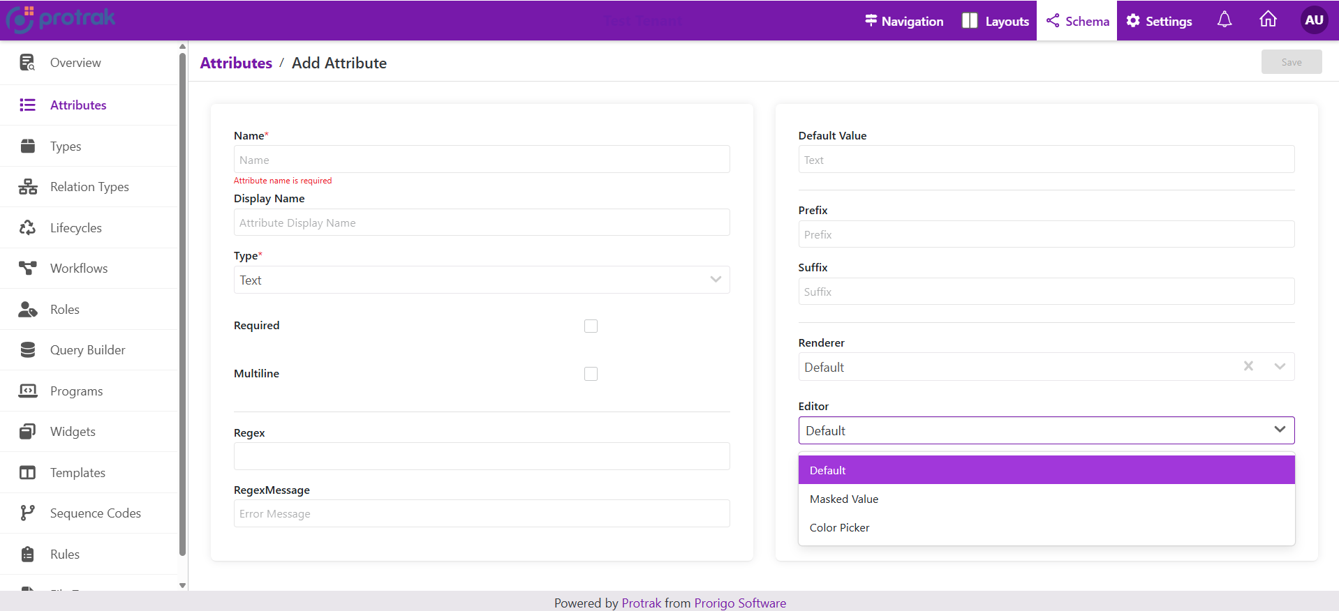
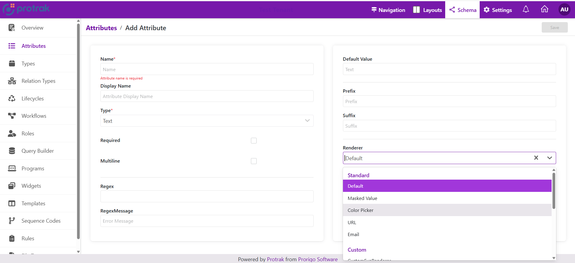
Renderers Editors For Attributes
-
Editor: the UI component that allows the user to input or change the value of an attribute (for example, a text box, dropdown, date picker, or checkbox).
-
Renderer: the UI component that displays the attributes value in a read-only or formatted way (for example, showing a formatted date, a colored label, or a masked password).
Standard Renderers and Editors by Attribute Type
1. Text Attribute
Editor Options for Text Attribute
| Name | Display Name | Description |
|---|
| Default | Default | Standard text input editor. |
| MaskedValue | Masked Value | Input field with masking (e.g., for phone numbers, SSN, etc.). |
| ColorPicker | Color Picker | Allows users to pick a color, stores the value as text (e.g., hex code). |
Renderer Options for Text Attribute
| Name | Display Name | Description |
|---|
| Default | Default | Standard text display. |
| MaskedValue | Masked Value | Displays the text in a masked format (e.g., hides part of the value). |
| ColorPicker | Color Picker | Renders the text as a color swatch or visual color representation. |
| Url | URL | Renders the text as a clickable hyperlink. |
| Email | Email | Renders the text as a clickable email link (mailto:). |
2. Date Attribute
Editor Options for Date Attribute
| Name | Display Name | Description |
|---|
| Default | Default | Standard date picker input (uses <ProtrakDate /> component for date selection). |
| MonthYear | Month Year | Specialized editor for selecting only month and year (uses <MonthYearAttributeEditor />). |
Renderer Options for Date Attribute
| Name | Display Name | Description |
|---|
| Default | Default | Standard date display (uses <FormattedDate /> to show the date in the configured format). |
| MonthYear | Month Year | Specialized renderer for displaying only month and year (uses <MonthYearAttributeRenderer />). |
3. DateTime Attribute
Editor Options for DateTime Attribute
| Name | Display Name | Description |
|---|
| Default | Default | Standard date-time picker input (uses <ProtrakDateTime /> for selecting both date and time). |
| Time | Time | Specialized editor for selecting only the time part (uses <TimeAttributeEditor />). |
Renderer Options for DateTime Attribute
| Name | Display Name | Description |
|---|
| Default | Default | Standard date-time display (uses <FormattedDateTime /> to show date and time in configured format). |
| Time | Time | Specialized renderer for displaying only the time part (uses <TimeAttributeRenderer />). |
4. Numeric Attribute
Editor Options for Numeric Attribute
| Name | Display Name | Description |
|---|
| Default | Default | Standard numeric input editor (typically a number field for entering values). |
Renderer Options for Numeric Attribute
| Name | Display Name | Description |
|---|
| Default | Default | Standard numeric display (shows the number in the default format). |
| Unformatted | Unformatted | Displays the numeric value without any formatting (e.g., no commas, currency, or decimals). |
| PhoneNumber | Phone Number (NANP) | Renders the numeric value as a North American phone number format (e.g., (123) 456-7890). |
5. Picklist Attribute
Editor Options for Picklist Attribute
| Name | Display Name | Description |
|---|
| RadioButton | Radio Button | Displays picklist options as radio buttons for single selection. |
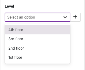
| Dropdown | Drop Down | Displays picklist options in a dropdown/select menu for single selection. |
| Checkbox | Checkbox | Displays picklist options as checkboxes for multi-selection. |
Renderer Options for Picklist Attribute
| Name | Display Name | Description |
|---|
| RadioButton | Radio Button | Renders the selected value as radio button style. |
| Dropdown | Drop Down | Renders the selected value as dropdown style. |
| Checkbox | Checkbox | Renders the selected value as checkbox style. |
6. Boolean Attribute
Editor Options for Boolean Attribute
| Name | Display Name | Description |
|---|
| Default | Default | Standard boolean input, typically rendered as a checkbox |
Renderer Options for Boolean Attribute
| Name | Display Name | Description |
|---|
| Default | Default | Standard boolean display (e.g., shows checked/unchecked, Yes/No, True/False). |
| ReadonlyCheckbox | Readonly Checkbox | Renders the value as a disabled (readonly) checkbox for display only. |
7. Reference Attribute
Editor Options for Reference Attribute
| Name | Display Name | Description |
|---|
| Default | Default | Displays reference options in a searchable paginated popup with data grid for selection. |
| Dropdown | Drop Down | Displays reference options in a searchable paginated dropdown for selection. |
Default Editor:

- Interactive Selection: Click on the search icon to open a popup with advanced selection capabilities
- Data Grid View: Displays references in a table format with columns for Name, State, and configured attributes
- Customizable Columns: Display specific attribute columns based on configuration
- Multi-select Support: Select multiple references when configured to allow multiple selections
- Filtering Capabilities: Filter references by attributes and states using a powerful filtering interface
- Dynamic Loading: Pagination support for efficiently handling large datasets
- Create Instance: Button to create new related instances directly from the selection popup (when enabled)
- Advanced Queries: Support for predefined attribute filters, state filters, and dynamic parent filters
Dropdown Editor:
- Dynamic Search: Real-time filtering of reference options as you type
- Paginated Scrolling: Progressive loading of results to optimize performance
- Multiple Selection: Support for selecting multiple references when configured
- Instance Management: Create new instances or link existing ones directly from the interface
- Optimized Data Loading: Asynchronous retrieval of reference data for efficiency
Renderer Options for Reference Attribute
| Name | Display Name | Description |
|---|
| Default | Default | Standard display showing reference names as clickable links. |
| ExpandableList | Expandable List | Compact display with "Show more/Show less" toggle for multiple references. |
Default Renderer:
- Displays referenced instance names as clickable links
- Opens referenced instances in new tabs
- Comma-separated list for multiple references
Expandable List Renderer:
- Compact view limiting display height
- Expandable view for complete list - "Show more" link appears when content overflows
- Responsive design that adapts to container width
- Maintains clickable links to referenced instances
- Ideal for attributes with many references
| Collapsed View | Expanded View |
|---|
 |  |